

← Back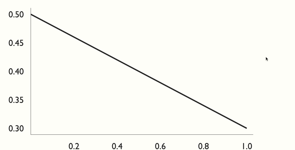
Scroller
The Scroller component is used to create scroll-based presentations. See this example for more details.
Props
- currentStep
variableThe index of the currently selected step.
- Example:
x
- Example:
- fullWidth
booleanIs this component fullWidth.
- Example:
true
- Example:
- currentState
objectThe state value associated with the currently selected step. Note you must set the state property on the step components for this value to update.
- progress
numberThe percent of completion (0-1) of the currently selected step
- offset
number(number 0 - 1, or string with "px"): How far from the top of the viewport to trigger a step. (default: 0.5) (middle of screen)
- debug
booleanShow scroller debug information.
Example Code
[Scroller currentStep:scrollerIndex]
  [Graphic style:`{padding: 50}`]
      [Chart type:`"line"` data:`scrollerChartData.slice(0, scrollerIndex + 2)` /]
  [/Graphic]

  [Step]## Hey, neat, here's some data![/Step]
  [Step]## ...   [/Step]
  [Step]## ...  What's that more data?![/Step]
  [Step]## Hmm...[/Step]
  [Step]## Too much data.[/Step]
  [Step]## Stop.[/Step]
  [Step]## that.[/Step]
  [Step]## data[/Step]

[/Scroller]